
Design Systems · Cargill
Sprout
Cargill's enterprise design system, built from scratch
Cargill is a global food and agriculture company with a fragmented digital ecosystem when I joined. As a design systems lead I built out the foundational layer of our design system, worked directly with teams to drive adoption, and am currently working on making it agent ready.
Problem
Prior design systems at Cargill failed because teams abandoned them
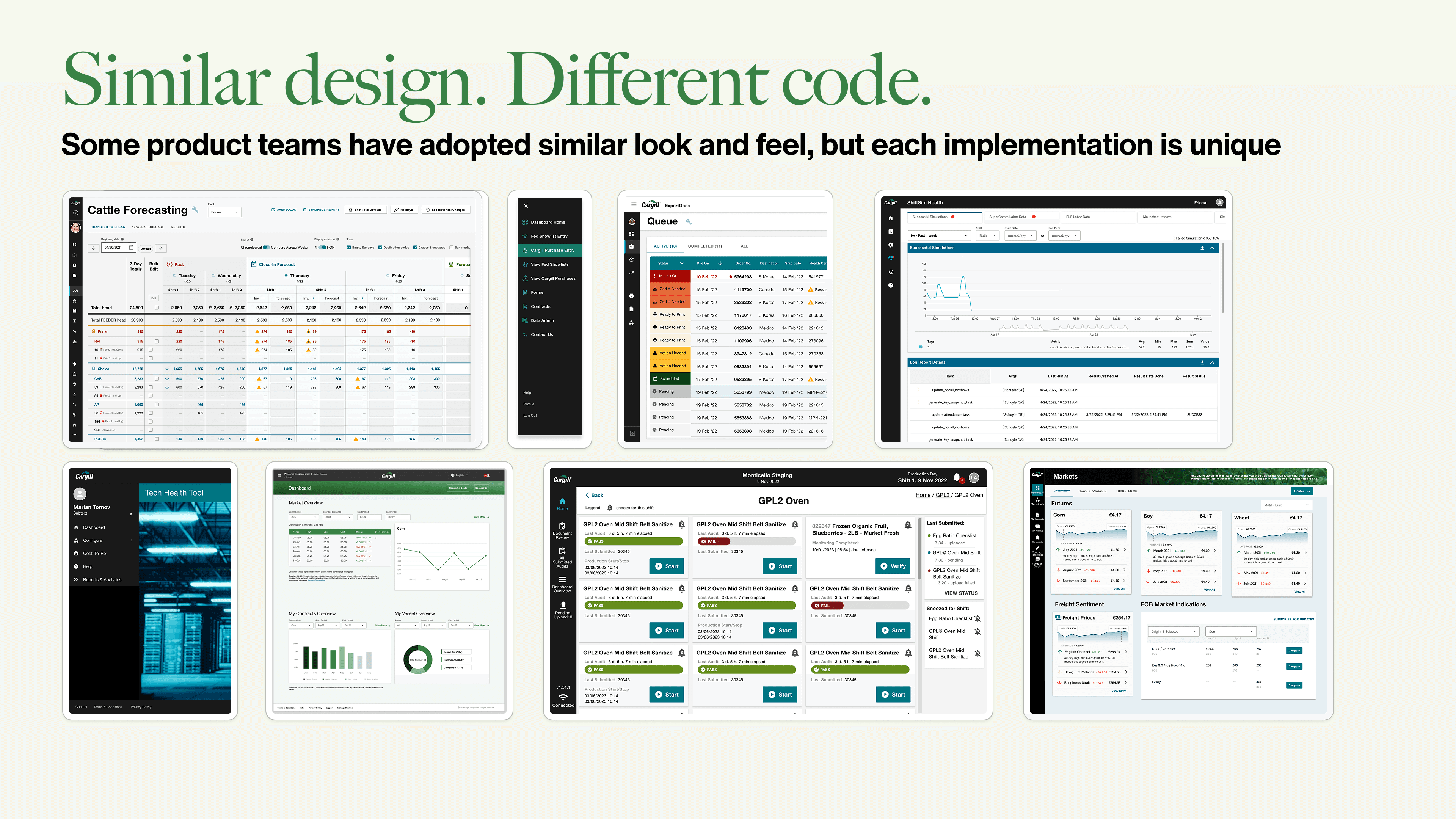
Cargill's predecessor system failed because teams detached components to work around its limitations. Once a team detached, the system lost them. There was no shared visual language across Cargill's digital ecosystem — and when teams arrived at similar designs anyway, each built them separately — redundant work with no shared foundation beneath it.
Sprout had to solve a technical problem, an organizational one, and a trust problem — with a three-person team and no existing playbook.
Foundation
Sprout needed a foundation that could hold at enterprise scale
All we had to start were Cargill's 2022 brand identity guidelines — print and marketing-focused guidance that didn't translate directly to digital. Building on them for a digital system meant making calls the brand team hadn't made.
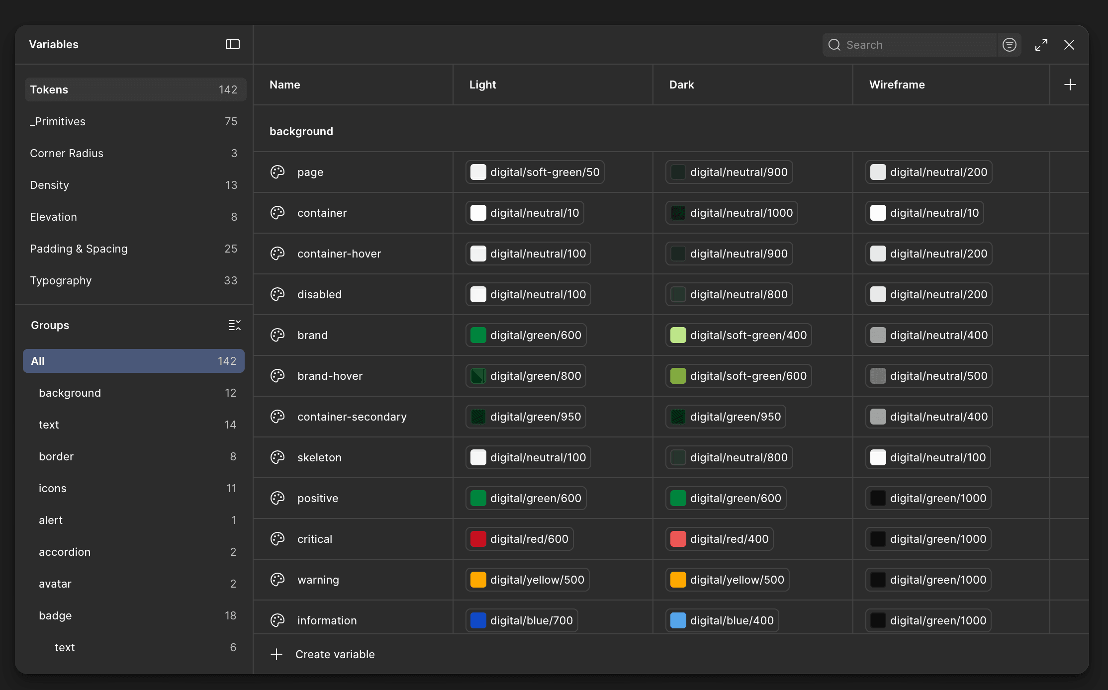
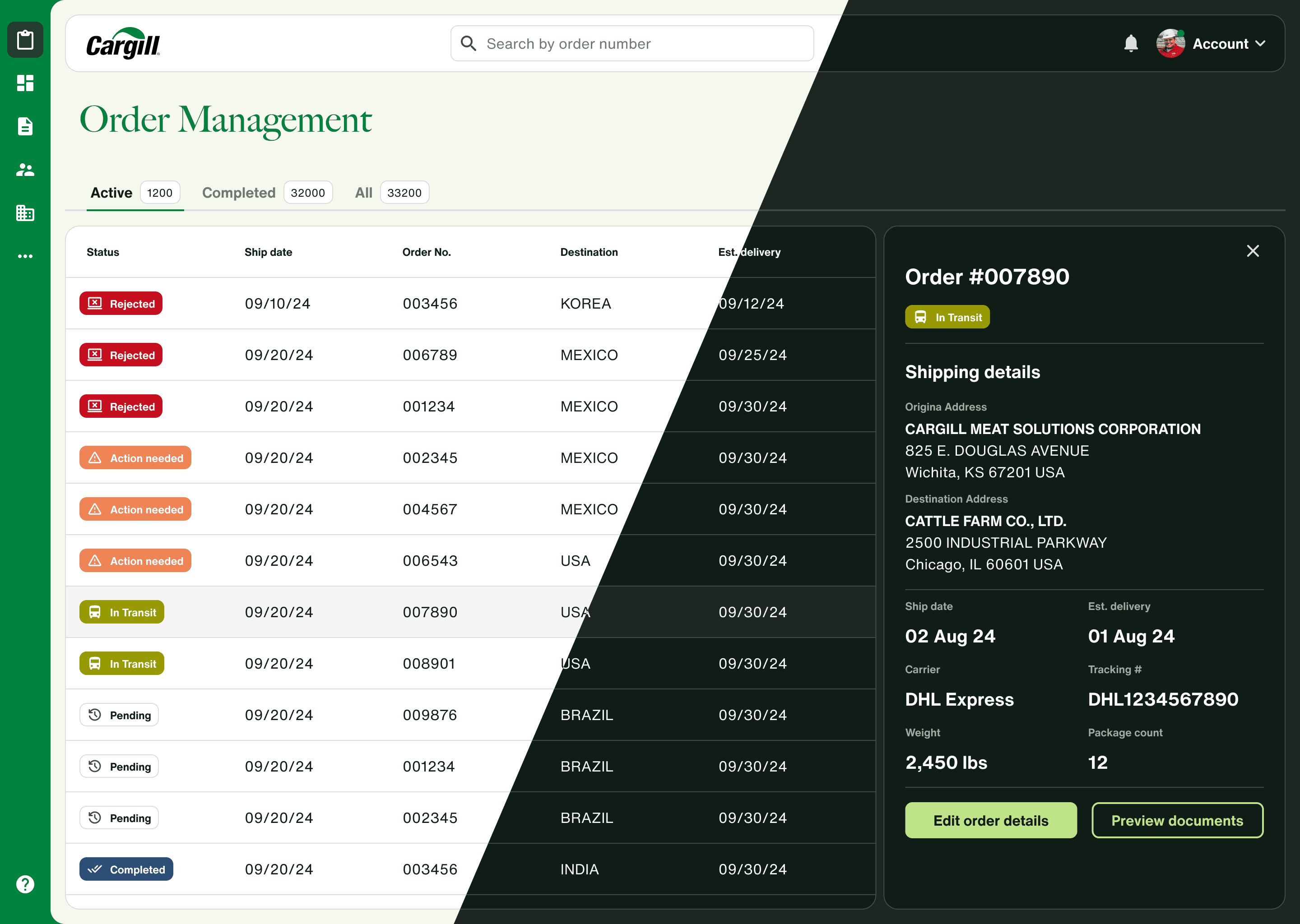
Color was the hardest part. The brand palette had no neutral range, so I built one from scratch. Figma had just introduced appearance modes, so we committed to dark mode from day one rather than retrofitting it later. Every color pairing had to pass accessibility checks, and the token structure had to hold across mode switches without breaking components.
Most of these decisions came down to accessibility and the discipline to make calls the brand guidelines left open.
Components
Consistency without rigidity: designing components teams would actually use
One of the biggest symptoms of DXO/DXP's failure was a high component detachment rate. Teams detached because the system couldn't accommodate what they needed to build. Every Sprout component had to be constrained enough to enforce consistency — and flexible enough that detaching was never the easier option.
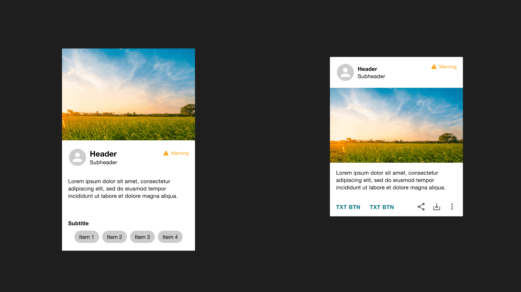
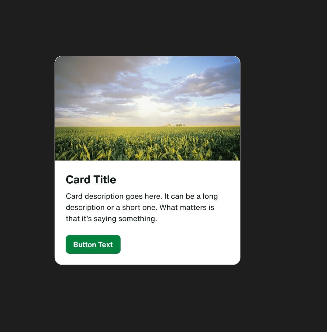
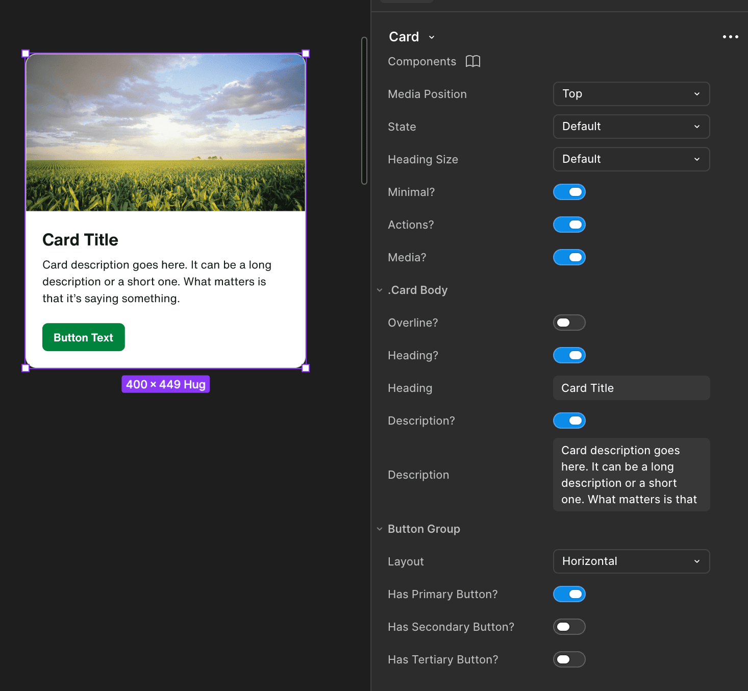
The card component is the clearest example. The predecessor system had one rigid variant. I built four:
Each included layout options for image placement, show/hide properties, and responsive behavior. These came from looking at what other systems got right and mapping what Cargill's teams actually needed to build.
Those decisions were validated by a 99.7% component retention rate and direct feedback from designers on how flexible the cards are to use.
Adoption
Building Sprout was only half the job
The easy part was building the system. The hard part was supporting teams through adoption.
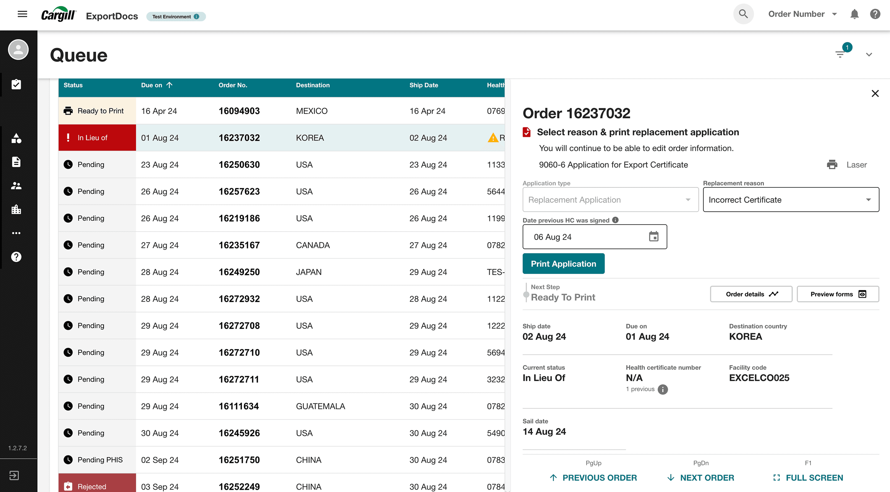
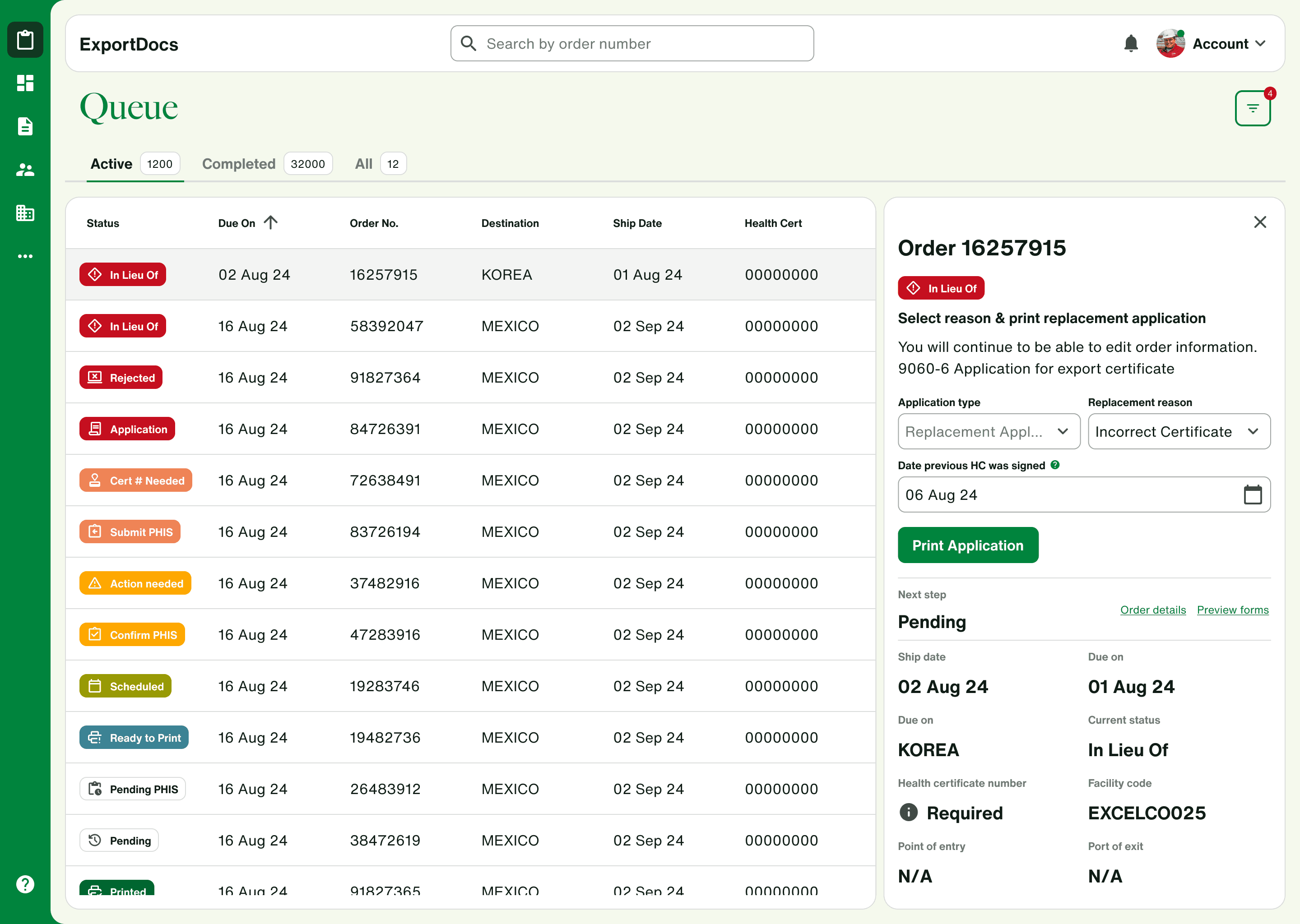
When a developer from an internal document management team needed to make the case for a Sprout migration to her stakeholders, I took her existing screens, mocked up a Sprout implementation, and gave her something concrete to bring into that conversation. She said it was extremely helpful for getting buy-in.
One designer was working within a ServiceNow-based platform where customization capabilities only stretch so far. I worked with her regularly to figure out what Sprout adoption was feasible within those limits.
Adoption wasn't a one-size-fits-all thing. I figured it out with each team as it came.
Scale
Sprout had to work without us in the room
Getting Sprout to a point where teams could use it without hand-holding meant thinking beyond the components themselves.
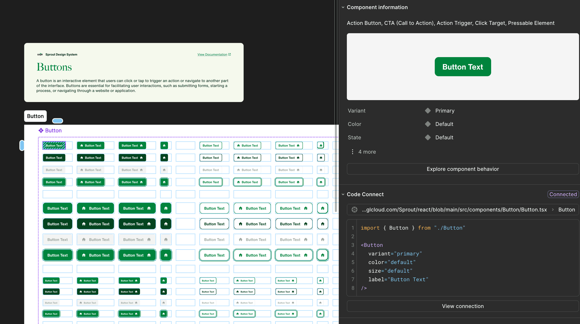
Code Connect
I advocated for it early and helped spec it out. First I mapped the gaps between how Figma and code represent components — in Figma, States are an explicit property; in code, that's CSS. I set up a recurring sync where design and dev met to align on properties and catch intentional drifts before they became permanent. That ran until Code Connect launched.
AI context files
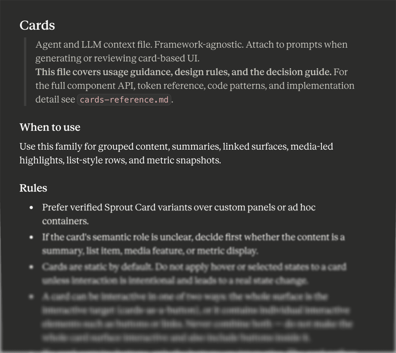
Tool-agnostic documents covering foundational guidelines and component-level usage — color, typography, token usage, buttons, cards — that can be fed into Claude or ChatGPT to get output that respects the system. I contributed heavily to the Themes context file and Button and Card usage guidelines.
The work never ends, but that's okay. Sprout is meant to be a system that grows with Cargill.
Outcomes
Sprout shipped
The cost savings came from delivering the Cargill.com brand refresh — About pages, Our Stories, and global landing pages — in-house on Sprout rather than through an external agency.
Reflection
What I'd do differently
Sprout is the first design system I've ever built. A senior UX coach who reviewed it described it as one of the most comprehensive design systems she had encountered. I'm so proud of how far the team and I have come having started from the ground up.
If I could go back, I'd rethink the token architecture and color scales early on. We kept values deliberately minimal, and as the system grew, that restraint worked against us. That restraint eventually backed us into corners a wider starting range would have avoided. I'd rather start wide and pare down than start narrow and run out of room.