UX Design · College Senior Year
Headspace
Embracing mindfulness in new and different contexts
Headspace is one of the leading mindfulness apps that primarily relies on audio-guided meditation to practice mindfulness. My team and I questioned whether there are new ways to encourage mindfulness that fit different lifestyles and contexts.
Research
Feature analysis revealed a consistent gap
We explored other mindfulness apps to identify what they did well that Headspace didn't. Every standout feature pointed to the same gap: Headspace had strong content but was weak on customization and personalization.
 How We Feel
 Lungy
Lungy Calm
Calm Breathe
 Waking Up
Key insights
Four insights from 20 students and a therapist
The most counterintuitive finding: students who said they didn't meditate would describe activities that were, functionally, mindfulness. The barrier wasn't motivation — it was that "mindfulness" felt like a structured commitment most users weren't willing or able to make.
Meditation feels like a hard stop, not a break
Clarity happens during routines, not apart from them
Students prefer visualizations and hands-on learning
Varying interpretations of mindfulness are discouraging
Design strategy
Stop making meditation easier. Start expanding what counts as mindfulness.
The research pointed to one thing: stop trying to make meditation easier to access, and start expanding what Headspace could count as mindfulness.
Feature — Emotional Check In
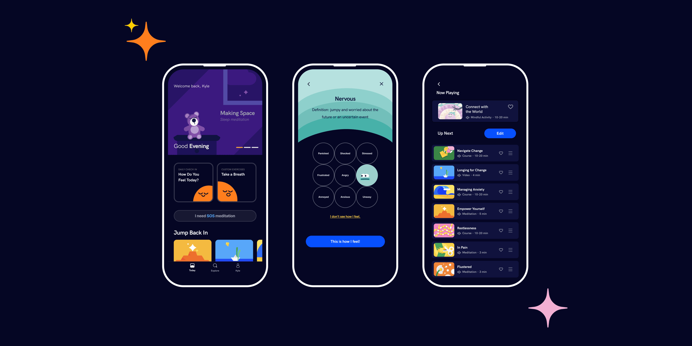
Redesigning the check-in from profile afterthought to home page anchor
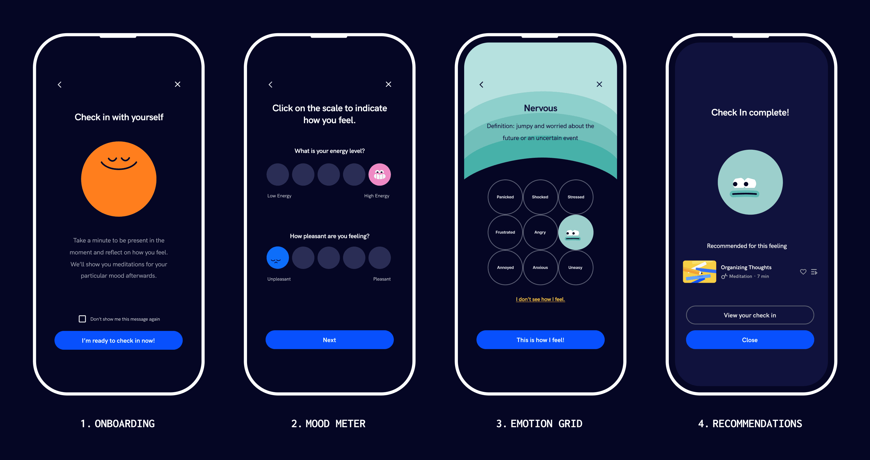
Headspace's existing check-in tracked two emotions: stress and anxiety. It lived in the profile section, which meant most users never found it. I redesigned it as a featured home page module — a multi-step flow using the mood meter method, contextual prompts, and content recommendations tied to the user's current moment.
Meditation feels like a hard stop, not a break
Students find clarity during activities within their routines
Students prefer visualizations and hands-on learning
Varying interpretations of mindfulness can be discouraging
Usability testing
Testing revealed the Check In needed to explain itself
Users flagged two things that broke the experience. The first was orientation — they didn't know what the Check In was for or why it opened with a breathing exercise. A single onboarding screen fixed both.
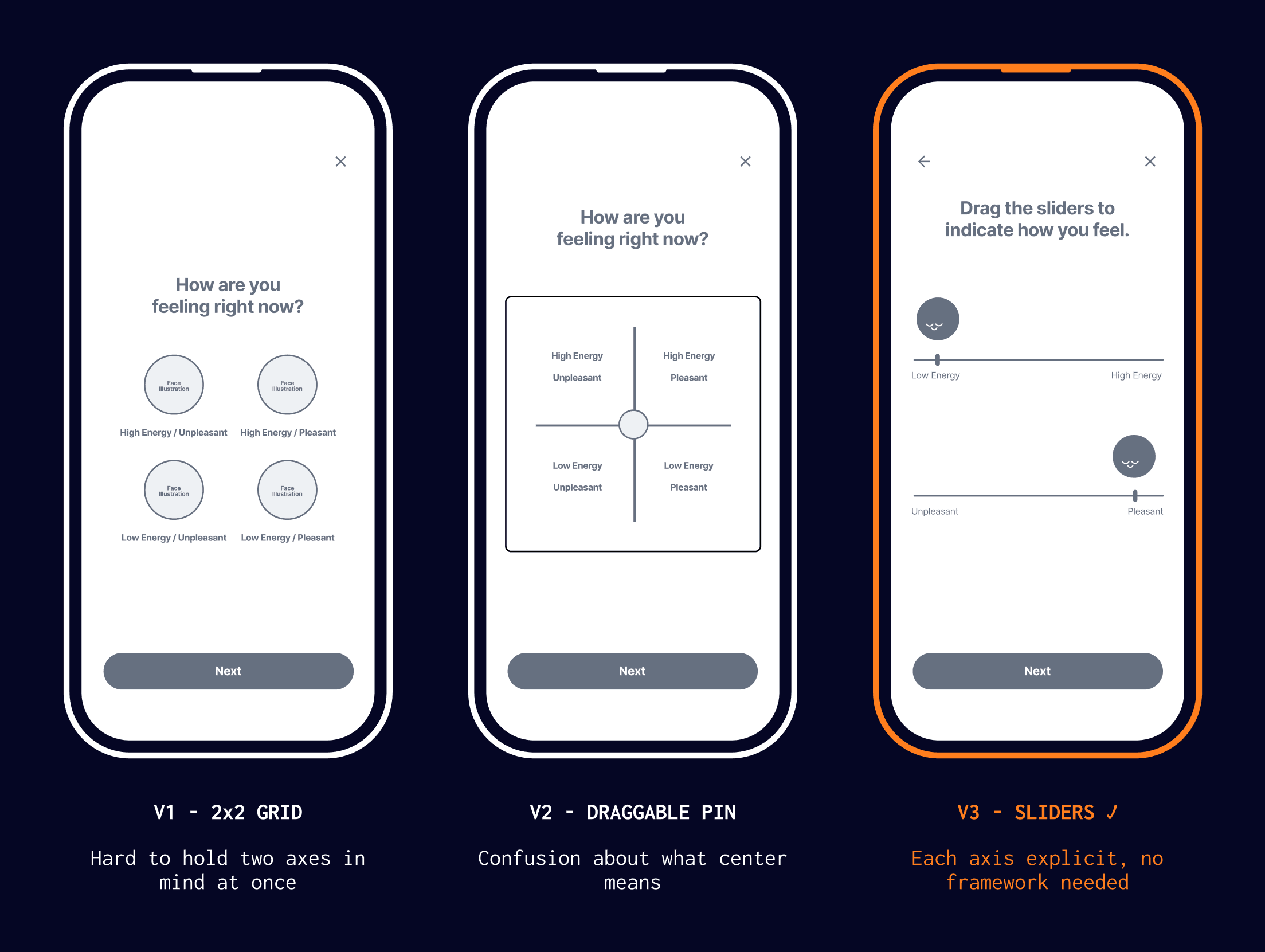
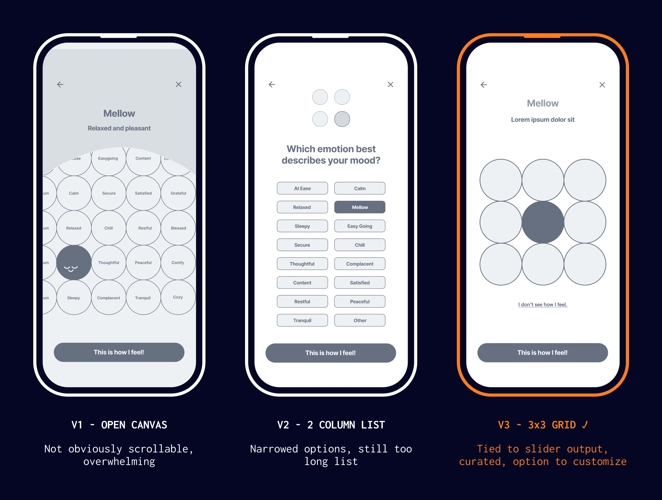
The second problem took more iteration because it was two problems at once: how users calibrate their emotion, and how they pick one from a list.
Reflection
What I'd do differently
Working and leading this project showed me the value of usability testing — the smallest adjustments can make a significant difference. I learned that it's important to build in multiple rounds of feedback and speak to users early. Ideally, we would have run a second round after our changes. We didn't have the bandwidth, but it's something I'd build in from the start next time.