B2B Product · Solo Designer
Chekt
Simplifying the food pick-up experience
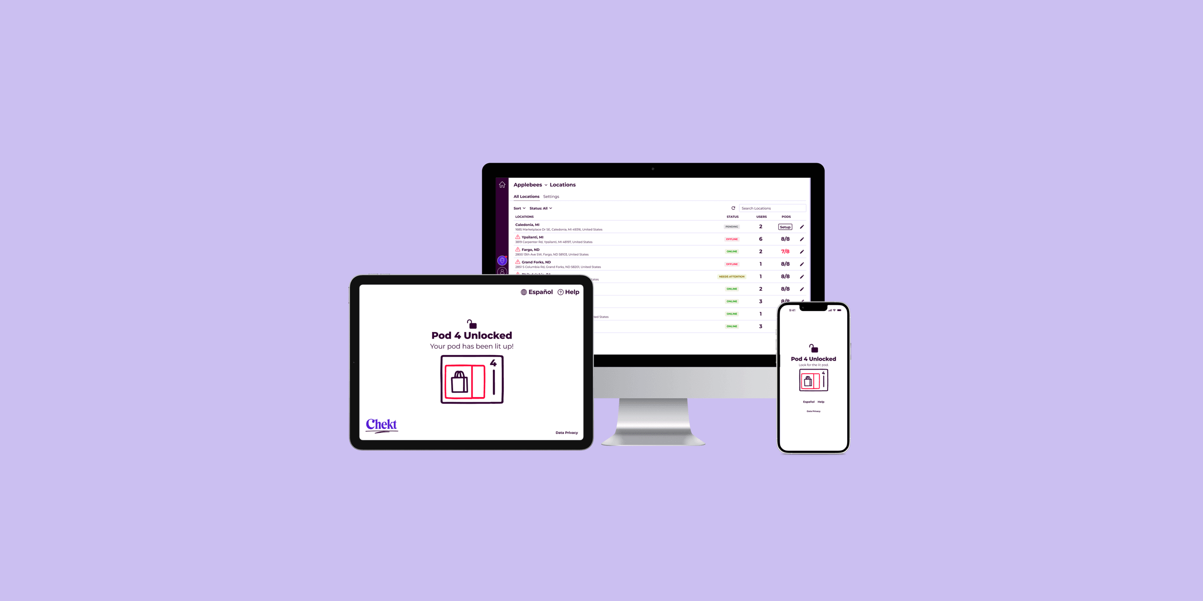
Chekt is a secure food locker system dedicated to meeting the demands of high-volume food service environments while maintaining a seamless user experience.
Four focus areas
01 — Alcohol & cash order flows
When edge cases lead to a stronger system
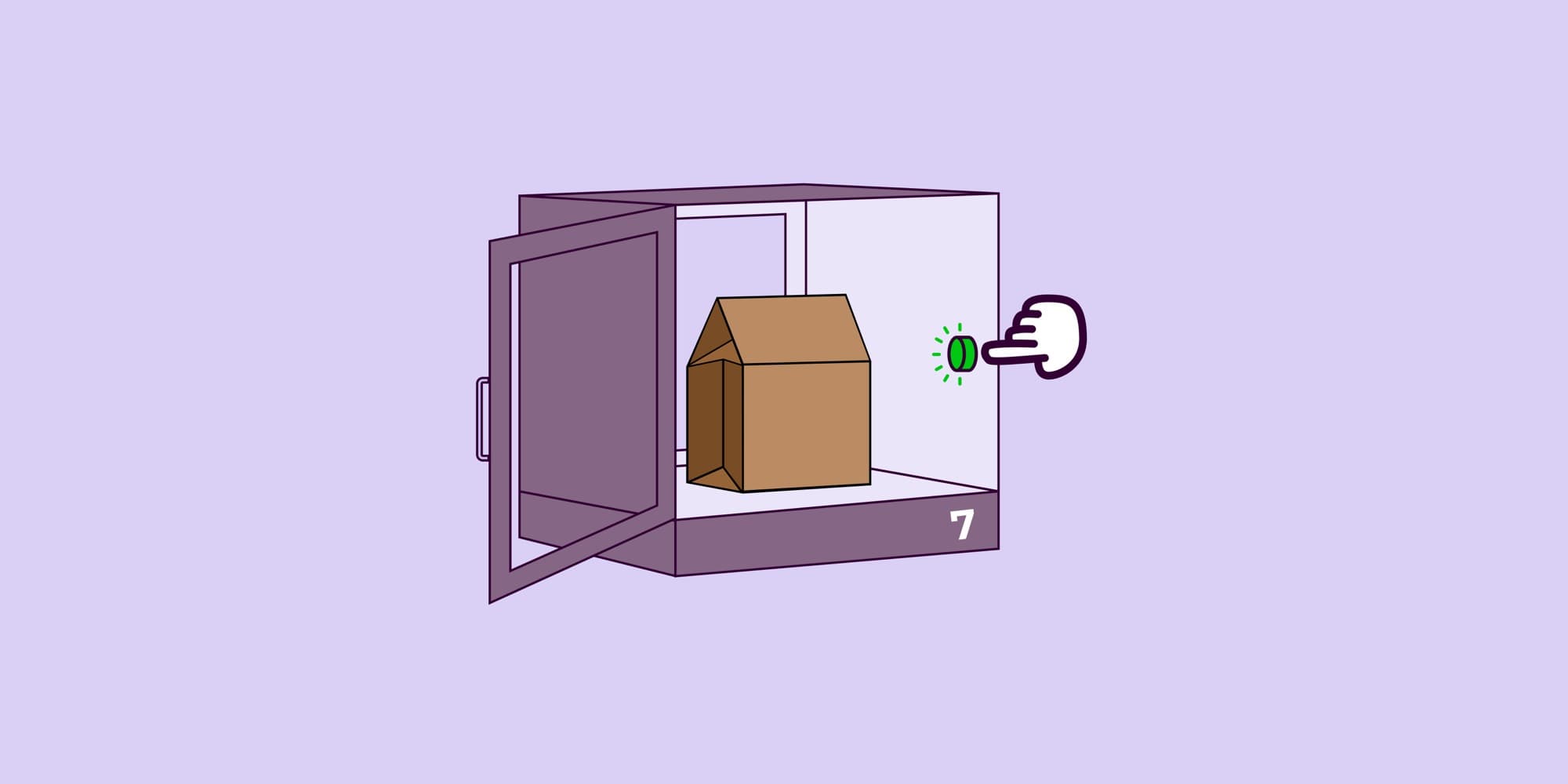
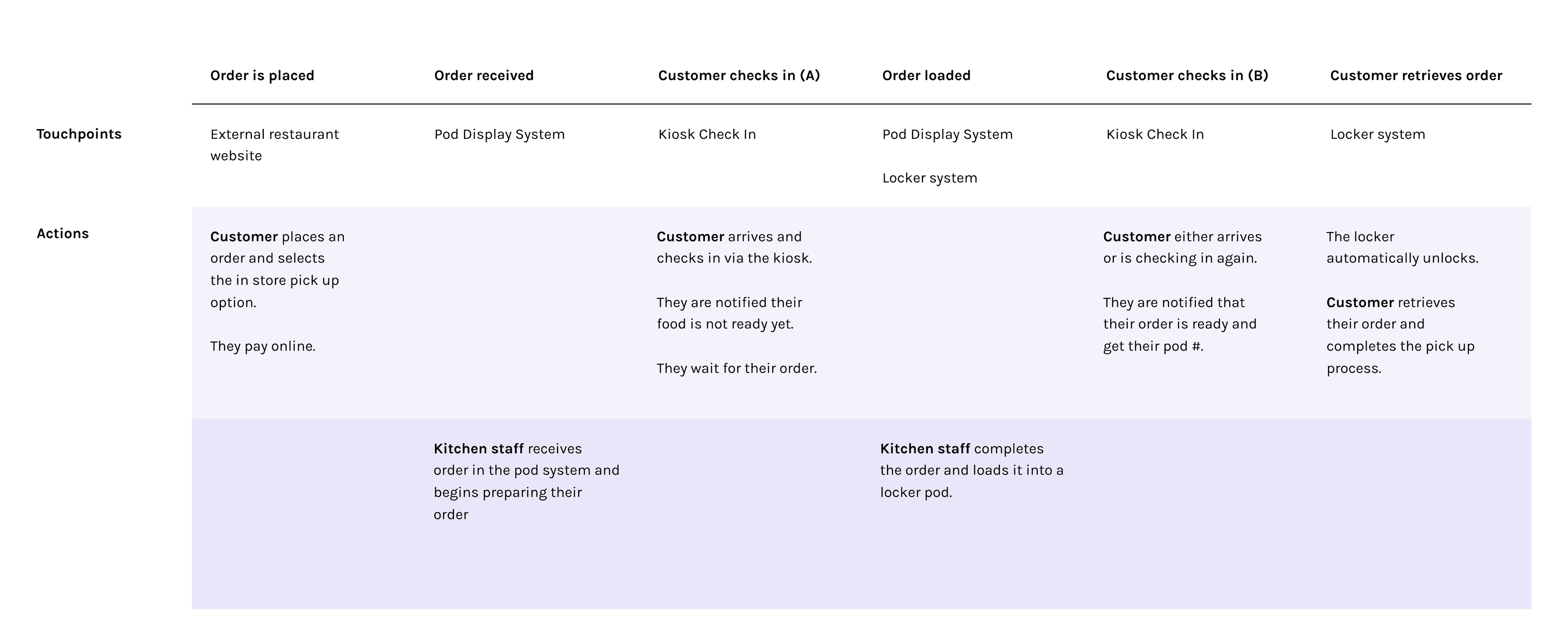
Chekt's default pickup flow was simple: order placed → food loaded into locker → customer notified → locker unlocks automatically.
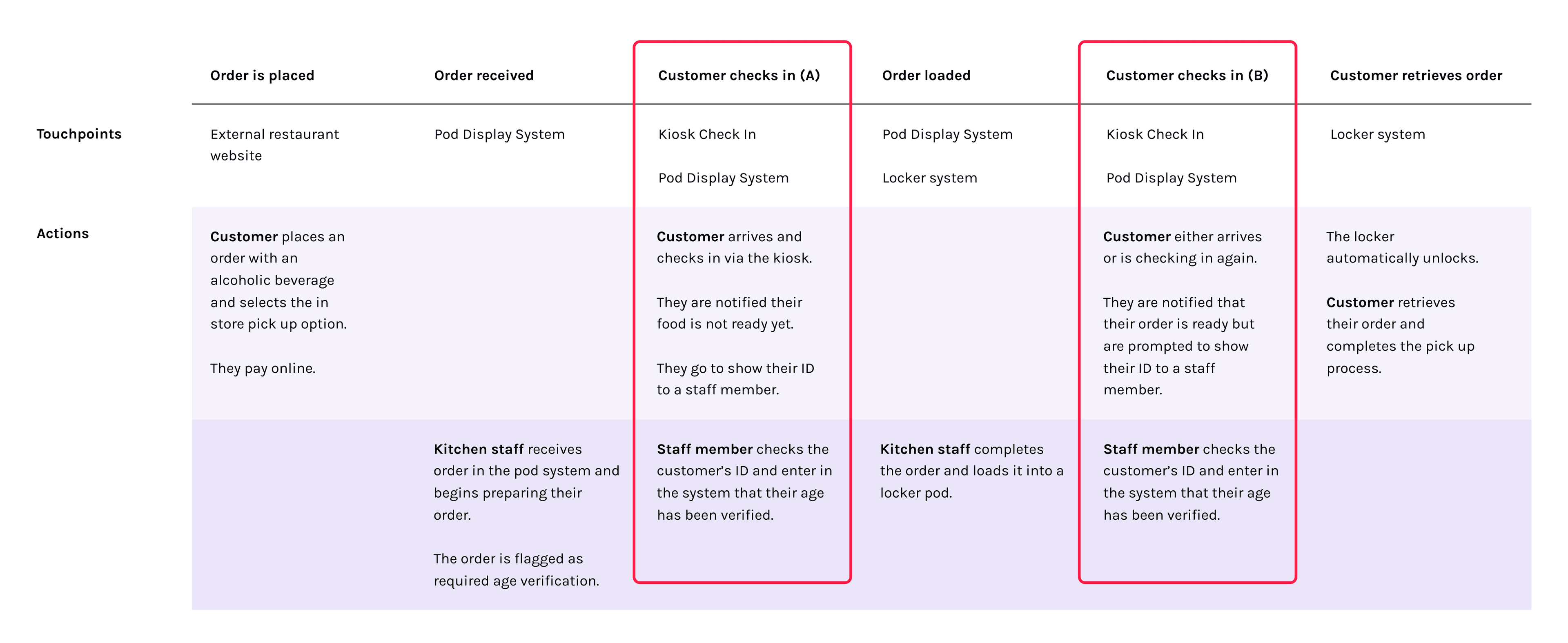
We had 2 new order types that couldn't follow this path due to legal requirements: orders with alcohol and unpaid cash orders. With no designed flow existing in our product, staff had to improvise leading to a disjointed experience.
How might we extend the pickup flow for orders that require staff intervention, without disrupting the existing experience, overloading a constrained visual system, or leaving customers confused?
Customer success as a research proxy
Without direct access to restaurant staff, I went through customer success reps to get legal requirements and hear what was actually breaking down on the kitchen floor.
One insight changed the shape of the solution
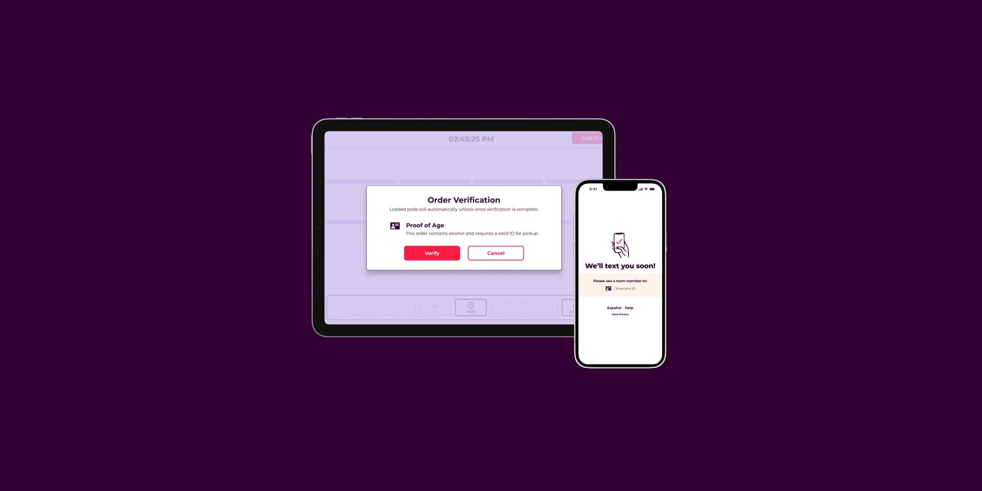
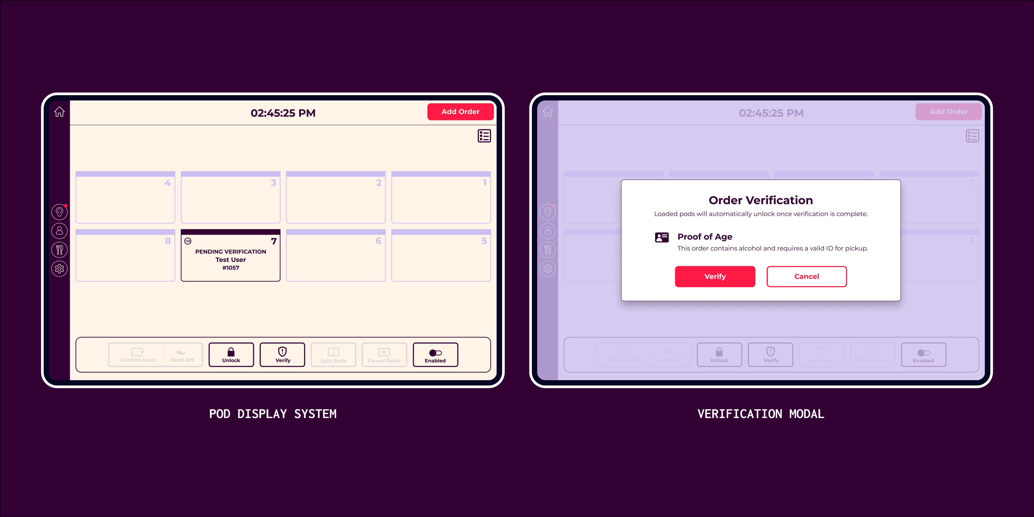
Both flows needed the same thing: a staff-customer handoff before the locker could open. That meant we could have one button instead of two separate actions on an already crowded bump bar.
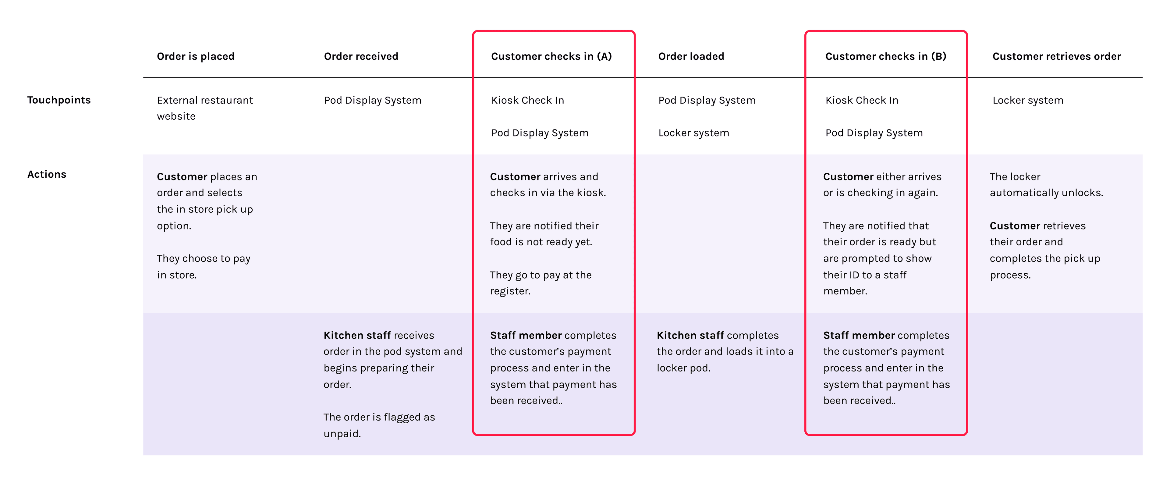
Icons over color for new states
With the addition of these new order types we needed a way to surface those in the pod display system. I had gotten feedback to "just add more color states" but with 7 statuses already mapped to a 5-color palette we were entering the territory where more colors actually causes more cognitive overload. Instead I opted for icons as an alternative supplementary visual to indicate which orders contained alcohol or were unpaid.
Solution
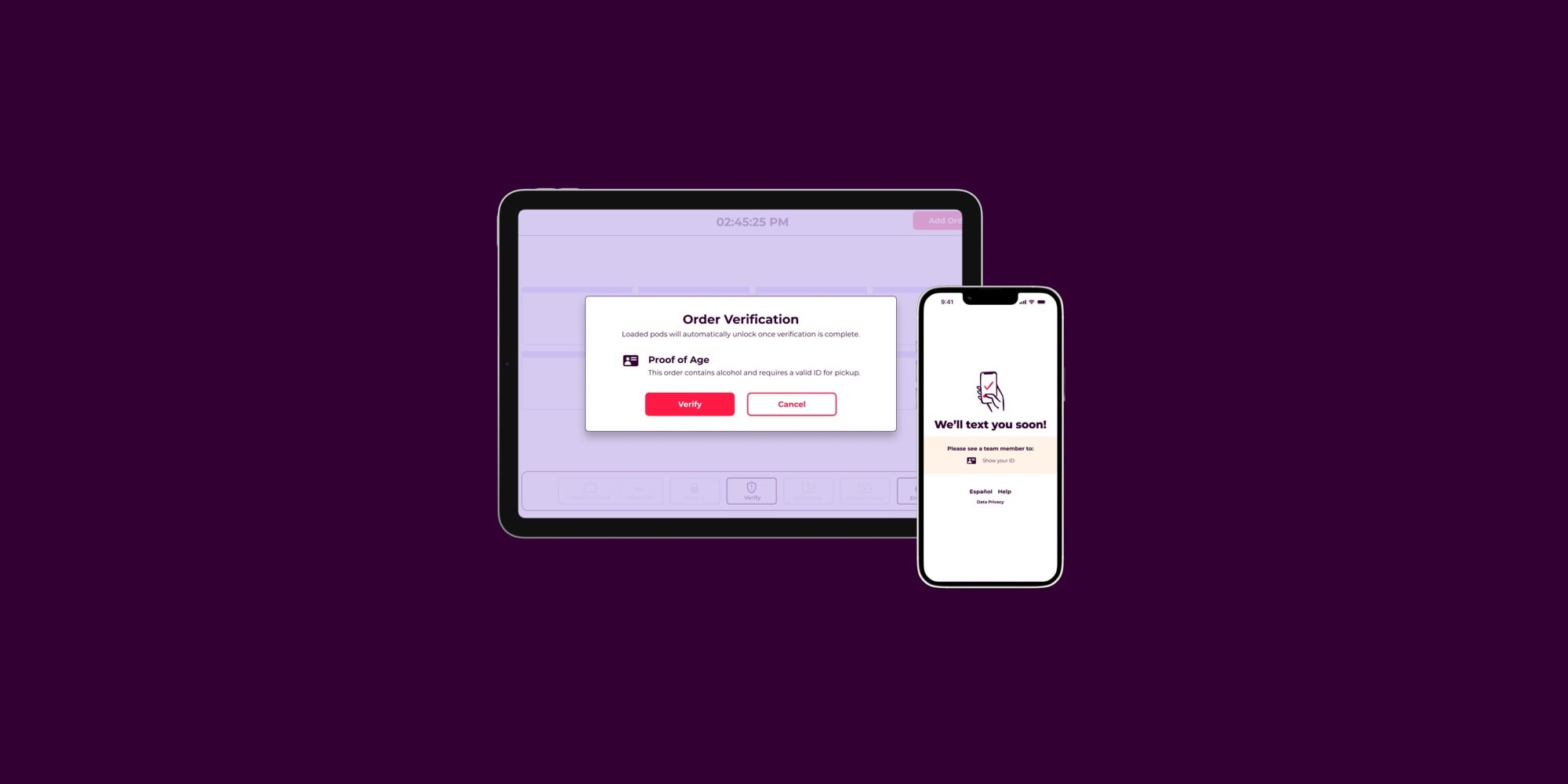
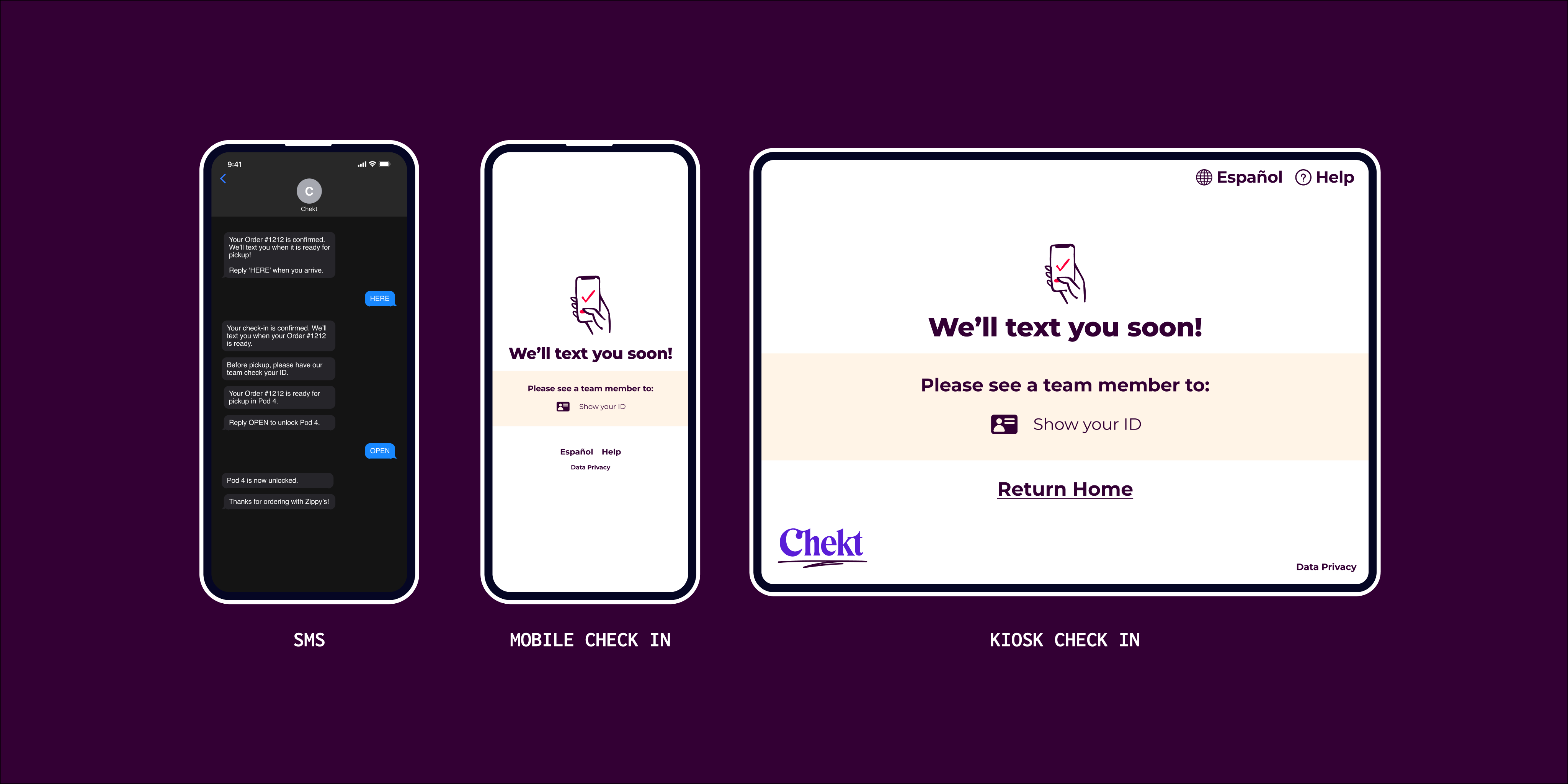
One Verify button handles both edge cases. On the kiosk, 5 end-screens cover every combination of order status and SMS opt-in.
Impact
02 — SMS modularization
Building a notification system that scales
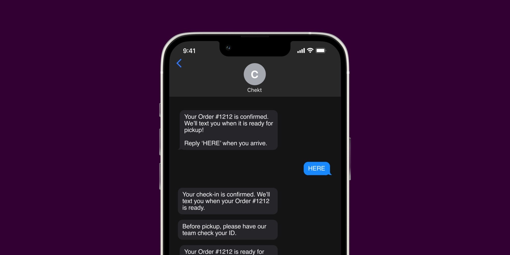
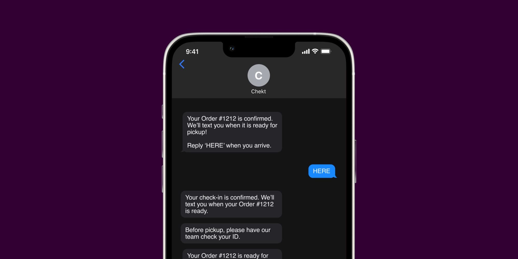
Chekt's SMS system grew alongside the product without a plan. Messages were hard-coded per scenario, with event names like customerHereAndOrderReadyForPickup. The alcohol and unpaid order work forced the issue — there was no clean way to add new notification logic without breaking an already fragile system.
How might we might we effectively notify customers of key order updates without overwhelming them with extra information?
A content audit first
I mapped every existing message against the customer journey to find what was being sent, when, and why. I found that the root of this problem wasn't due to excessive messaging but that none of our messages were reusable.
Inspired by choose-your-own-adventure games
I've always been a fan of branching narratives and CYOA games and noticed a lot of parallels between those forms of media and our customer journey maps. There's a main "storyline" or "happy path" the user follows but along the way depending on their specific use cases (alcohol included in their order or they arrived before food was ready) it can slightly change the mid-journey experience. In the end though these customer journeys all converge back to a shared resolution.
Carrying that insight into my solution I opted to set up a modular system that defined core events and conditional events that could easily be mix and matched depending on the situation to create a consistent and coherent notification experience.
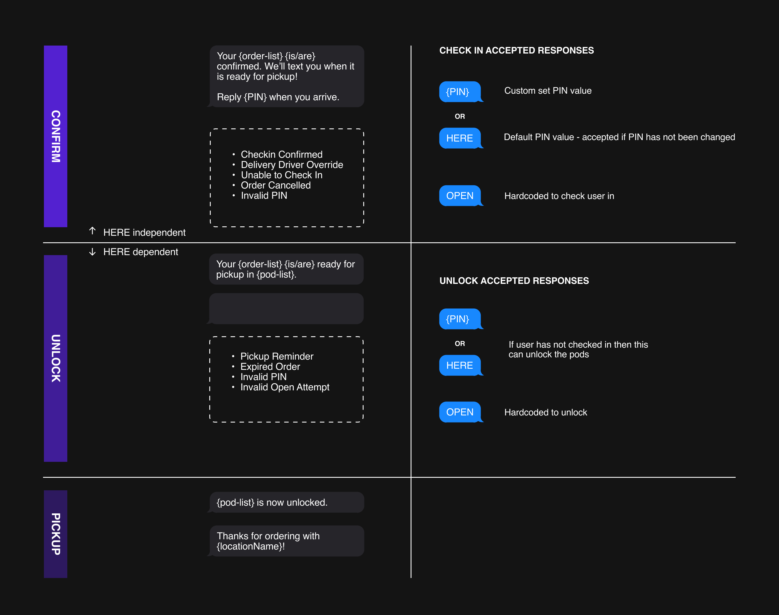
Solution
Modularizing our SMS system was an early idea I had and I advocated for it to be a higher priority in preparation for our alcohol and unpaid orders workload. Rearchitecting this foundational system made it easier for us to discuss the nuances of these new user flows and also made it easier for our developers and customer success teams to manage custom message notifications.
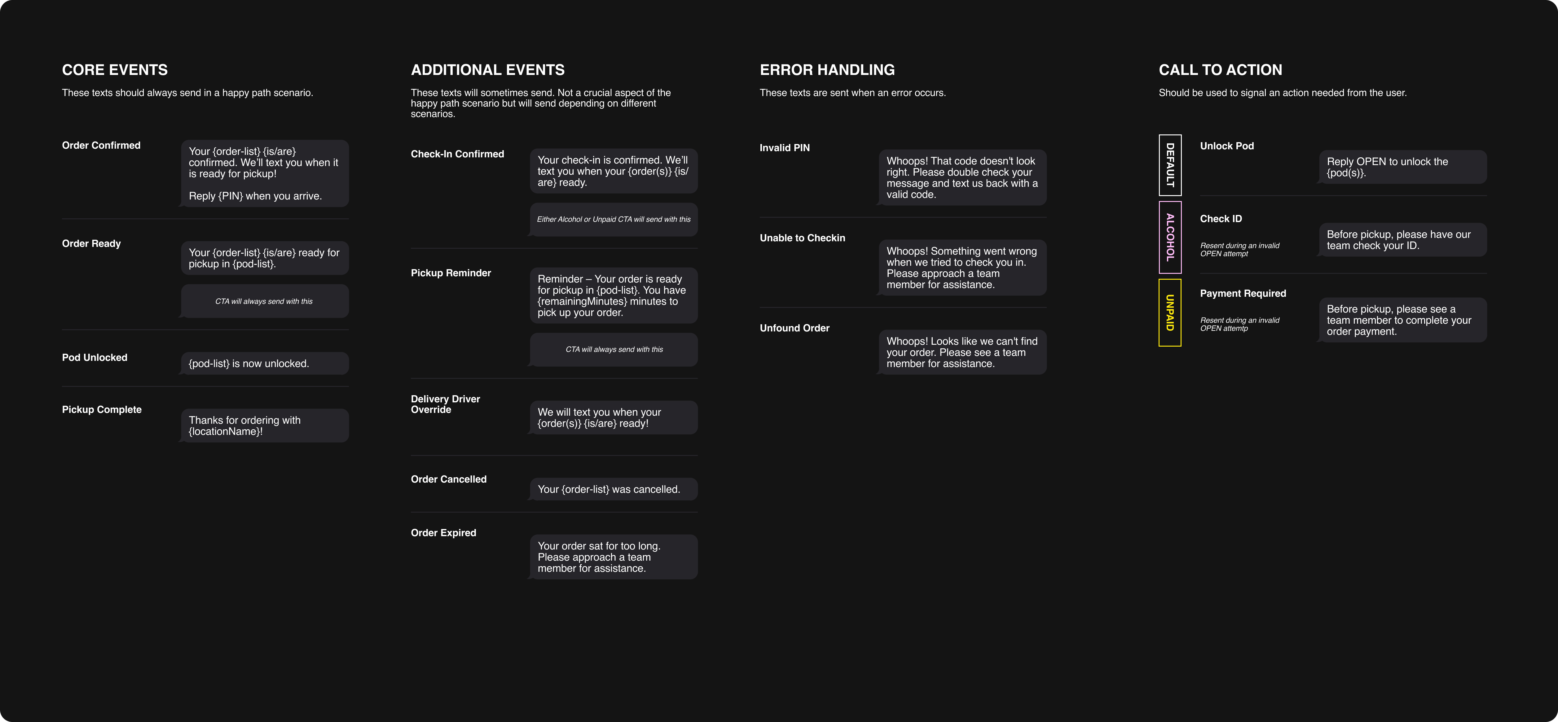
Impact
03 — Admin portal redesign
Giving support teams the visibility they need
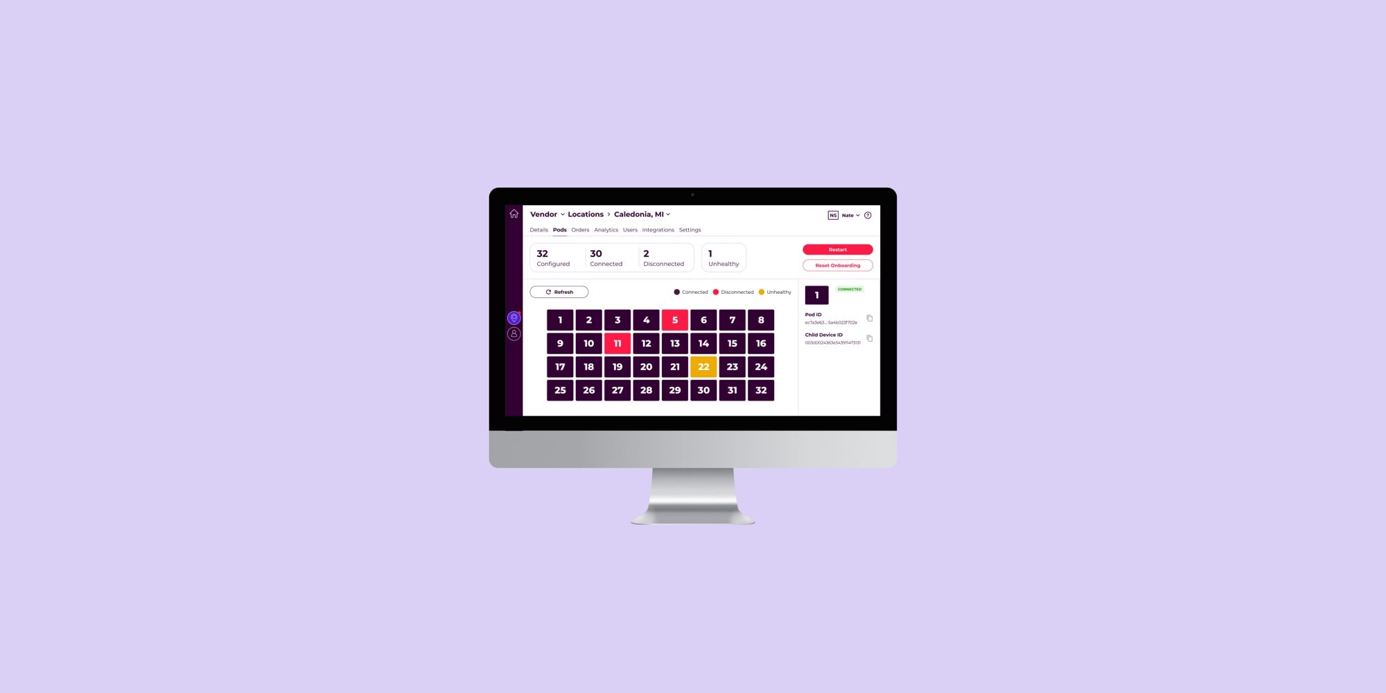
Since Chekt involved physical hardware, software bugs alone couldn't explain most support issues. Most support calls were about manually unlocking lockers for expired orders or tracking down offline pods. In order to solve these, the team needed to see into each locker system remotely but the existing portal wasn't built for that.
How might we redesign the admin portal so the Chekt support team can diagnose and resolve locker hardware issues quickly and remotely?
Learning the hardware to design for it
Chekt had its own language when talking about the hardware. Things like Pod IDs, connection states, and array configurations didn't mapped to conventional UI patterns. I spent time learning the hardware so the design decisions actually made sense.
Designing a compact but information-dense pod visualization
In talking with the support lead, customer success team and the engineering on-call team I learned that majority of their time troubleshooting was spent gathering information to decide what to do next.
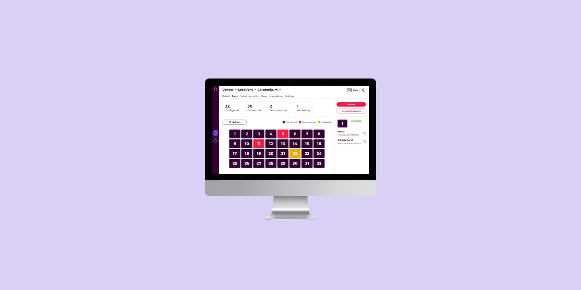
The challenge was getting all those layered information states (connected/disconnected, enabled/disabled, health status, position) into something small enough to scan in seconds.
Solution
Within the admin portal I created a page where everything the support team needed was in one place. Each feature maps directly to a support workflow: remote restart for stuck systems, one-click ID copy for dev debugging, and a pod visualization for at-a-glance hardware status.
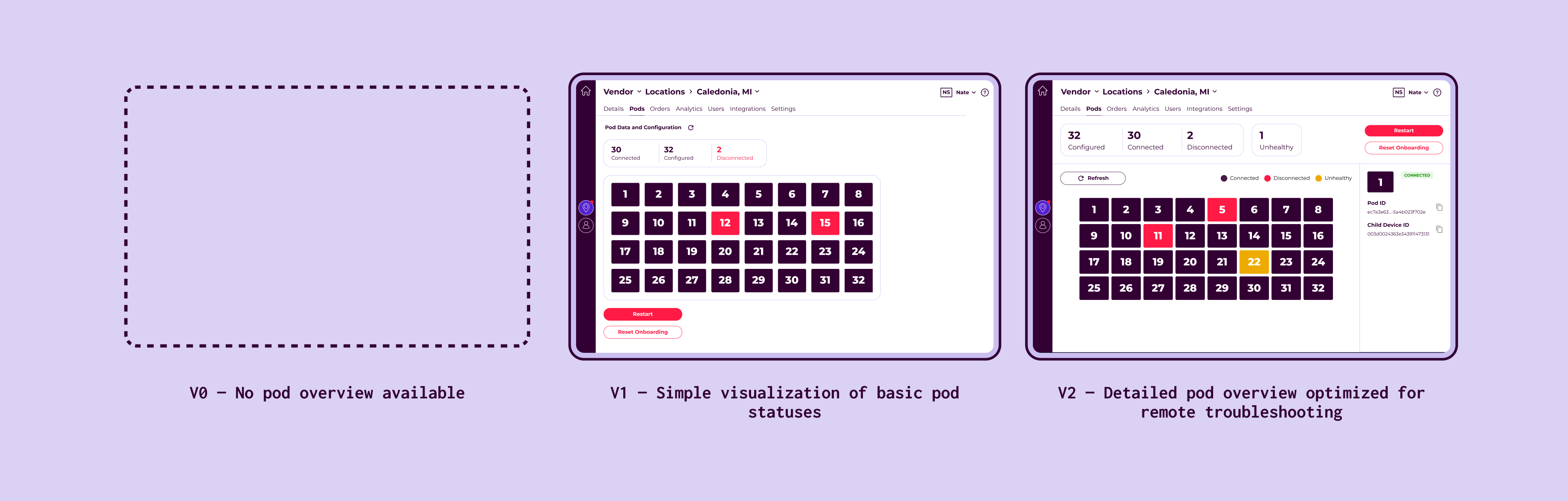
Impact
04 — Staff onboarding one-pager
Good UX also comes in the form of good documentation
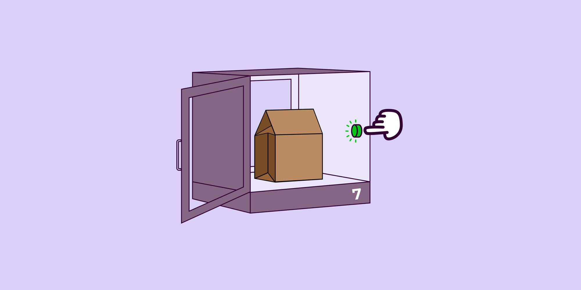
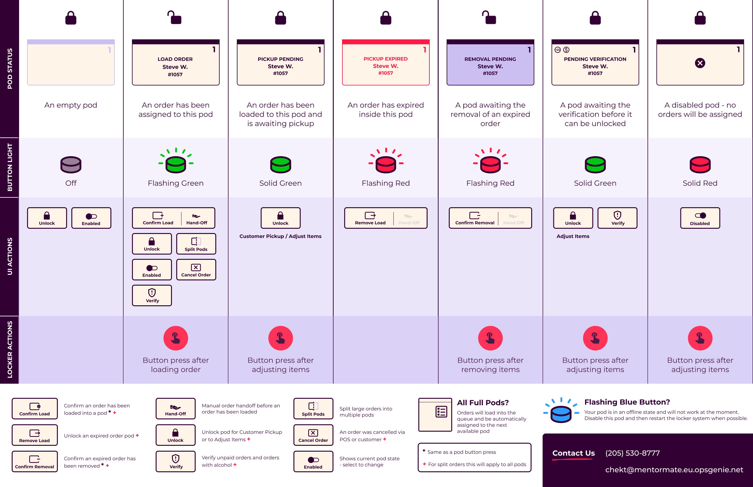
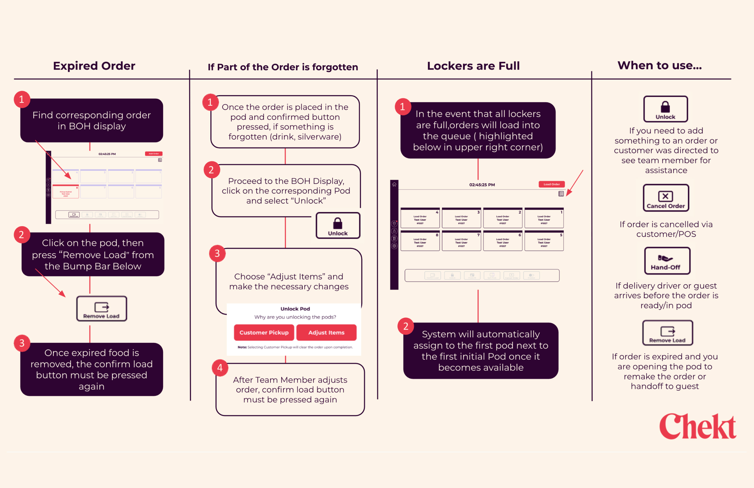
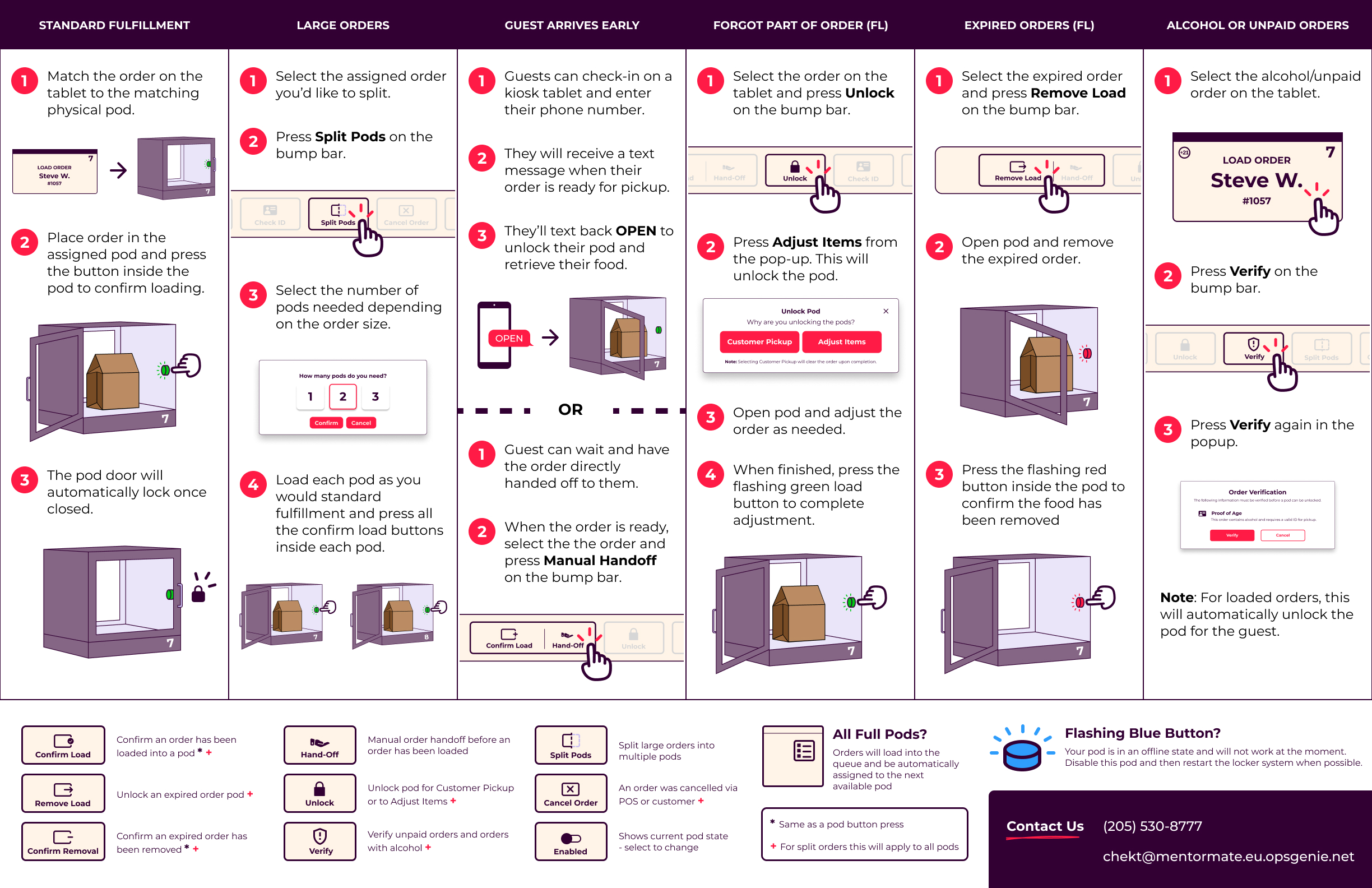
Kitchen staff had to learn a combined hardware-software system with states, buttons, and failure modes across both surfaces. New hires would get a PowerPoint deck, but during a busy shift, nobody opens a PowerPoint.
How might we give kitchen staff a reference they can use in a fast paced environment — one that makes a complex hardware-software system legible at a glance, without requiring any prior technical knowledge?
Inspired by kitchen appliance manuals
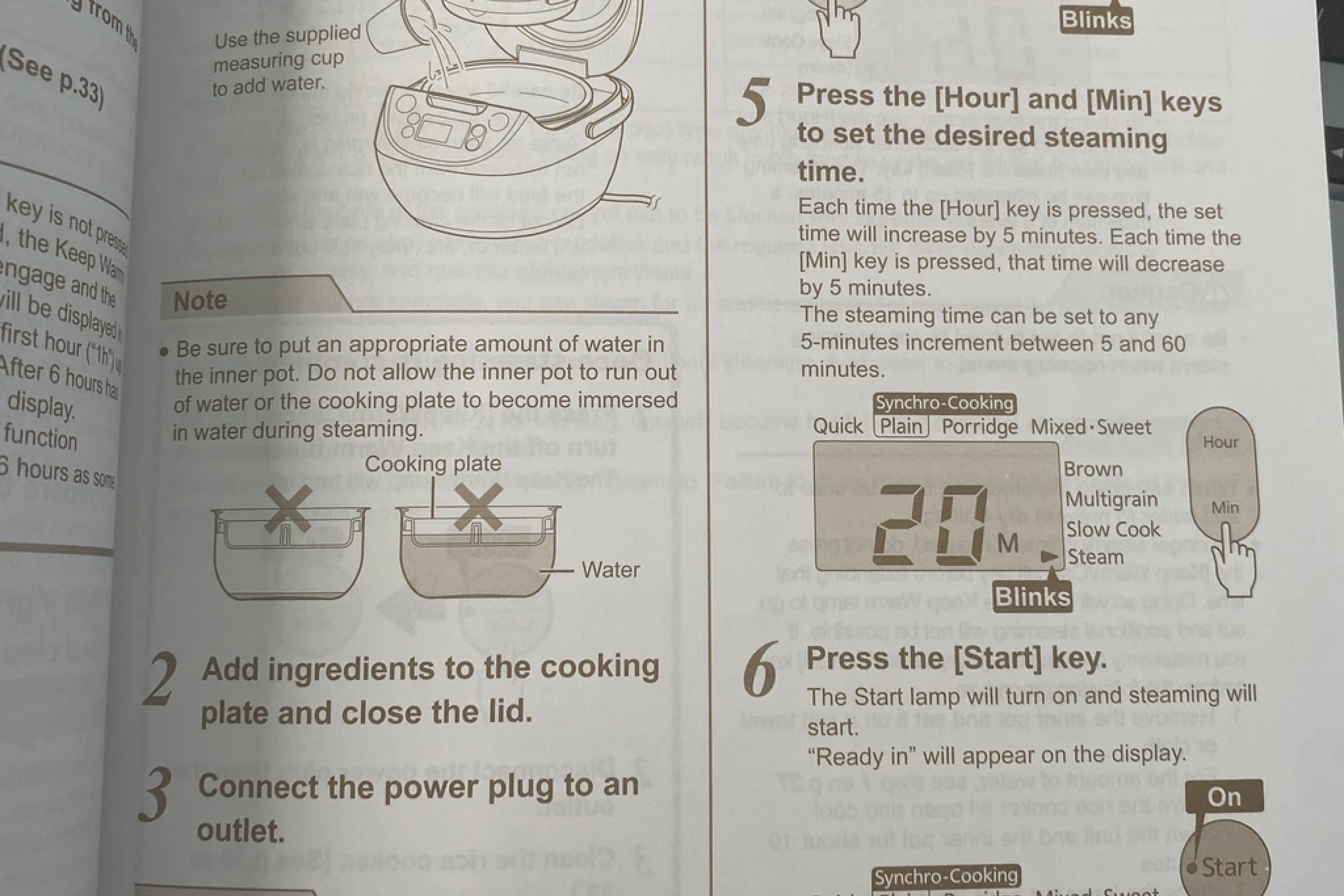
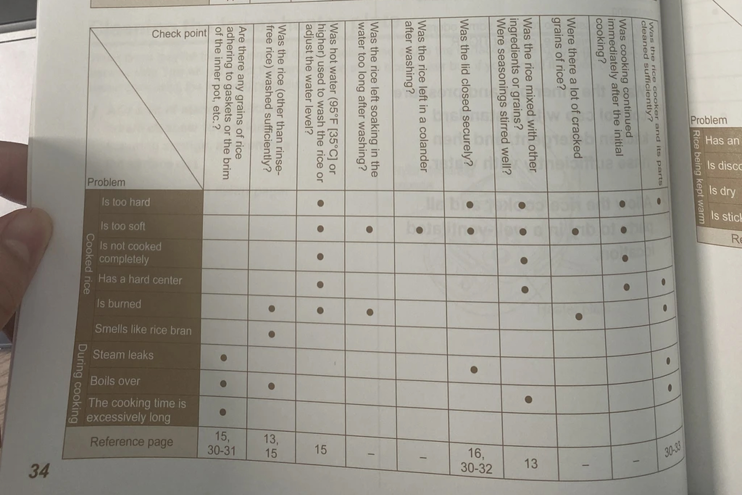
Around the time of this work I had just moved and was flipping through my own kind of "onboarding manual". My Nespresso and rice cooker guides were able to pack complex multi-state interactions into something a first-time user can scan in seconds. That became the design reference I abided by.
Solution
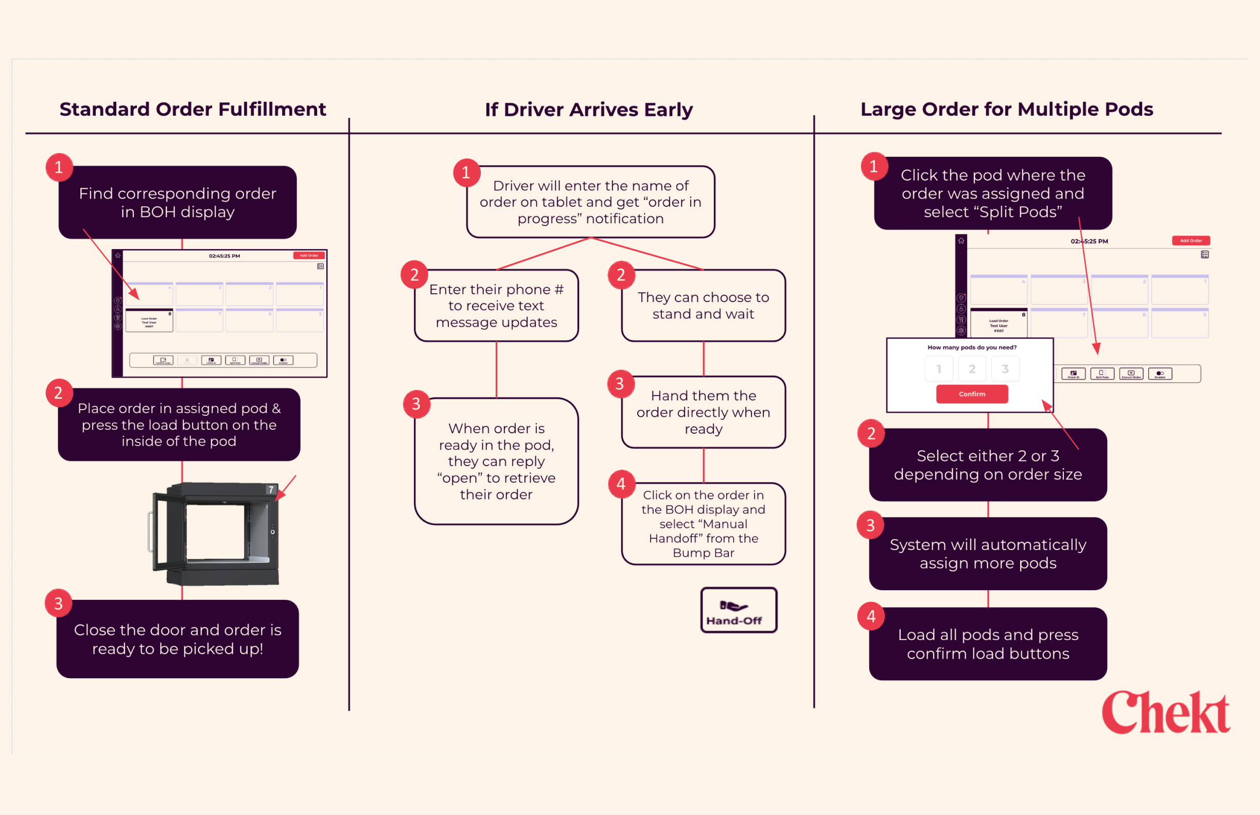
A laminated one-pager — Side A for at-a-glance reference, Side B for common shift scenarios — designed to live in the kitchen without requiring a device or login.
Impact
05 — Reflections
What I took away
During this role I learned how important language is when it comes to designing. Language when overlooked can severely impact a user's experience with a product but when used correctly can provide clarity and even delight to users. Tasks like error handling, text message notifications and even staff training materials required me to thoughtfully write UX copy.
Additionally I realized it was important to share a common language with my team when communicating about tasks. Not everyone knew all the design terms I'm familiar with and likewise I didn't always understand the technical terms my engineers used. It was a collaborative effort from the team to educate each other on these topics and also be receptive to the idea that sometimes we don't know everything.